Best in class: Top 10 packaging design round-up for 2021

Packaging design can make an enormous difference to the buying experience, even though consumers might not consciously realize this. So creating eye-catching, engaging packaging that is also optimized for color, is essential as it has an impact on overall sales.
We have curated a list of what we think are brilliant examples of creative packaging design for 2021 so far. Full of innovative ideas, inventive typography, beautiful illustrations, and more.
We hope you find inspiration for your own packaging design projects.
1. Xiaomi’s packaging redesign for spam
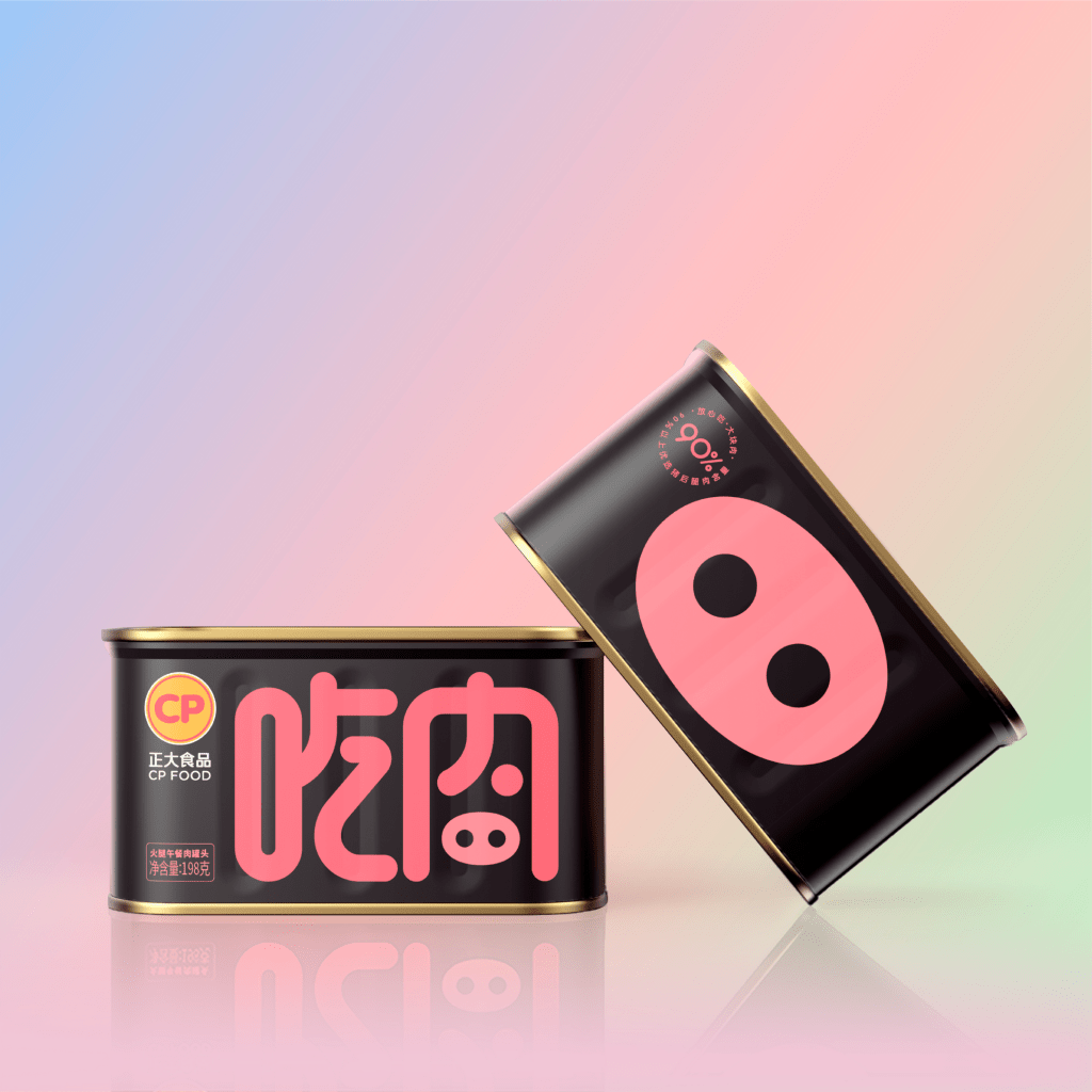
We think the playful re-design of Luncheon Meat (‘spam’) by Xiaomi is just superb! The judges thought so too awarding it the platinum award in the Branding & Consumer category 🌟.
Aimed at their younger target purchasing online the revised packaging stands out. Screaming fun and playfulness with a ‘piggy nose’ on the back of the pack. Perfect for engaging consumers.
Other design highlights are the eye-catching pink and pure black colors that create contrast. Whilst the font perfectly matches the tone of the brand. The oral expression of the Chinese characters “吃肉”(‘eat meat’) is transformed into the shape of a pig on the front of the pack.
Redesign perfection 💚.
Find out who else was named an award winner 👉🏼 https://buff.ly/3lgblNe
2. Animals Like Us: pet-food packaging
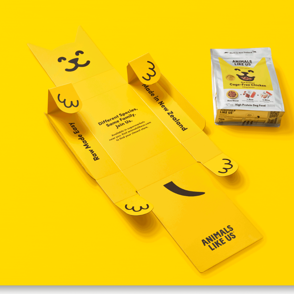
We love this pet-food packaging by Animals Like Us 💚. And the judges from Best Design Awards think it is a hot contender for the upcoming awards too!
Cute and quirky, Think Packaging has created pet-food packaging so perfect, it nearly deserves a cuddle! Dog-eared-shaped tear strips and the cutest little paws you’ve ever seen wrap around the premium food.
If your dog could talk, he would be telling you he loves it too 🐶
Find out more 👉🏼https://buff.ly/3z0ifuo
3. Cold Brew Coffee with Braille won Pentawards
Did you know that there are 1.3 billion blind people in the world?
We love that Supperstudio has designed a striking accessible label in Braille for the cold brew coffee drink, Only for Your Eyes, to raise awareness of this.
The label is made of ecological, naturally soft, extra-white felt-marked paper. The braille dots are made with screen-printed ink and screen-printed varnish.
For this stunning, thoughtful design won gold in the beverage category Pentawards 2021 💚.
Find out who else was a category winner 👉🏼 https://bit.ly/3jstaYp

4. Senza’s Cannabis inspired sparkling water packaging
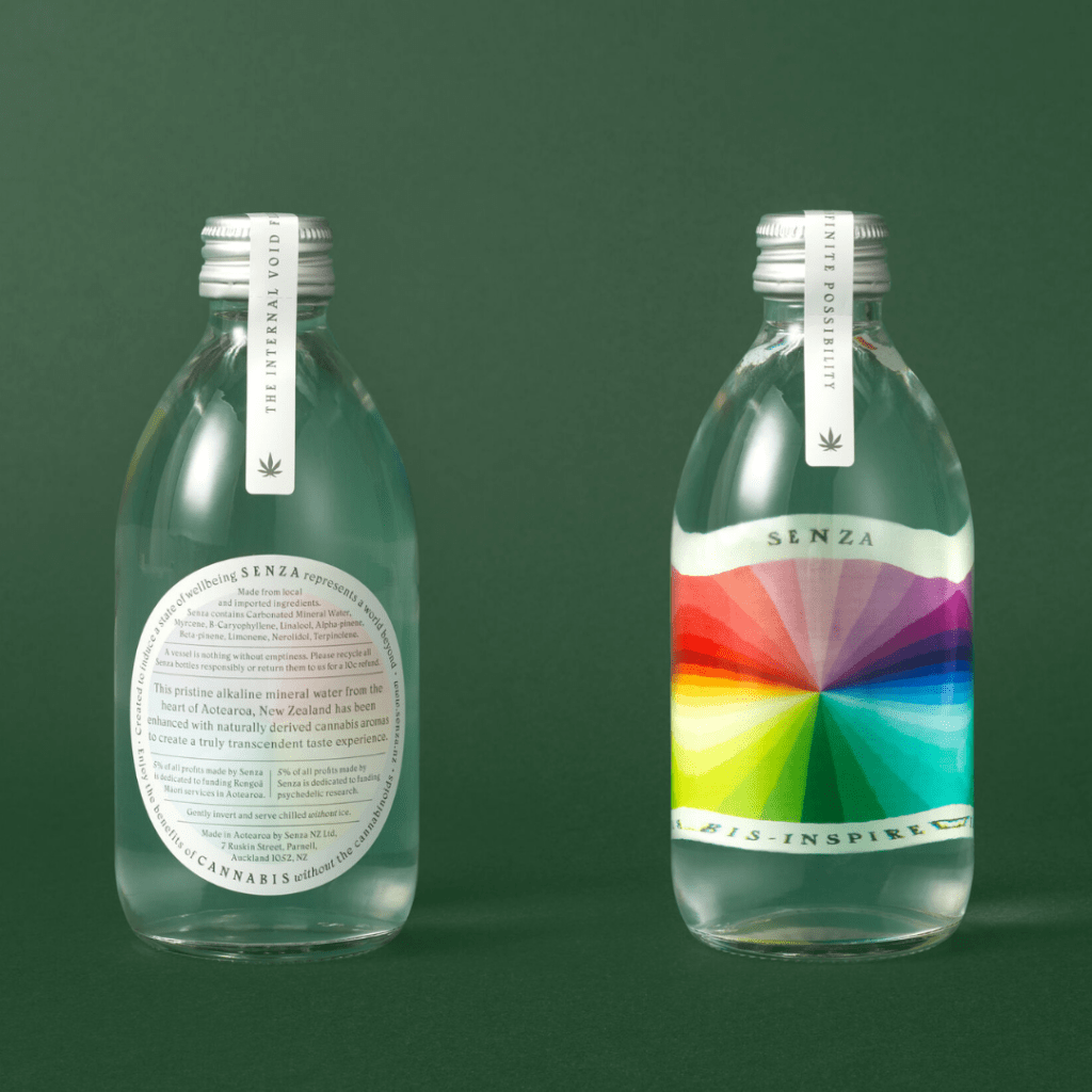
We think the packaging design of Senza is sublime. 🌈
This first-of-its-kind sparkling water communicates benefits clearly the benefits of cannabis without cannabinoids whilst enticing with a kaleidoscopic bottle.
One to watch out for at the upcoming Best Design Awards. 👀
Find out more 👉🏼https://buff.ly/3D0nkW3
5. Oreo’s “Thins Protection Program”
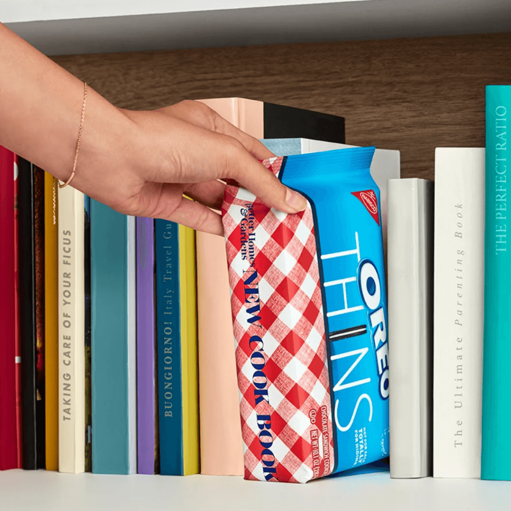
Crazed about Oreo? Then you will love the new Oreo Thins with their unique packaging that allows them to be hidden in plain sight 😲.
Oreos have teamed with multiple brands to create the “Thins Protection Program”, which consists of special edition packaging to camouflage the treats.
Better Homes & Gardens helps disguise the biscuits as a cookbook with a red and white gingham pattern. For treats on the go, Ford inspired a car manual that can be stashed in the glove box. Hanes helps hungry dads to hide the thins in their t-shirt drawer. For those that like their cookies cold, Greengiant helps disguise the Oreos in their freezer drawer as vegies. A sure way to deter the young ones.
Where would you hide yours to stop the cookie thieves? 🤔
Find out more 👉🏼 https://buff.ly/3igKbDj
6. Volfas Engelman’s Beer Mail packaging design
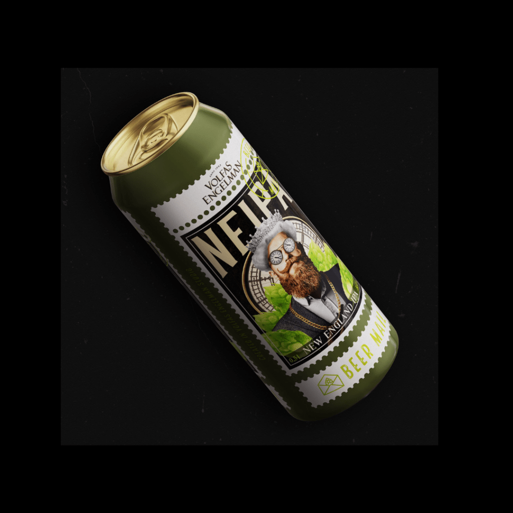
We think that the design of Beer Mail by Bold Brands agency is outstanding. And the judges thought so too, awarding the Volfas Engelman Nealkoholinis series of beer varieties the platinum award for packaging design at the Museaward 🌟.
If you look closely, the illustration is framed by a stamp to depict its unique (sometimes even collection-worthy) design. The design itself is a collage conveying the layers of flavor that will surprise, as well as reflecting the gentlemanly qualities of the beer brand.
A great way to make an impact in a category that is filled with bold package designs and creative illustrations 💚.
Find out more 👉🏼 https://buff.ly/3hGj9ox
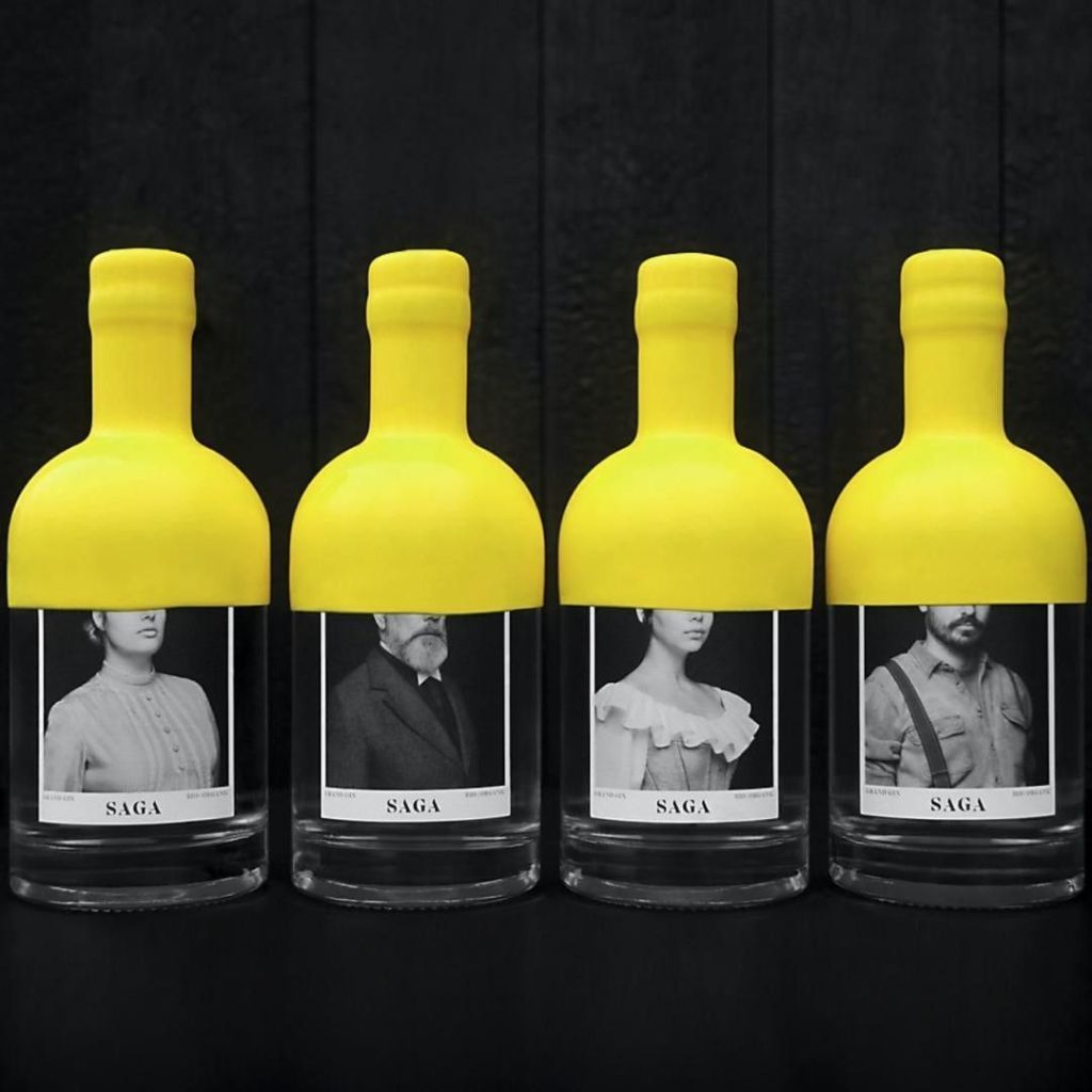
7. Saga Grand Gin: distinctive packaging
We love that Saga Grand Gin has won the Neenah Paper Award at the 2021 Dieline awards 🙌 .
Distillerie Grand Dérangement along with their design agency Paprika produced this eye-catching gin packaging that stands out in the crowd. The packaging pays homage to the Acadians who were deported from Canada in 1755 – in particular, detailing the stories of four individuals. We think it’s ingenious that the bright yellow wax sealing of the bottle extends almost halfway to cover the eyes bringing mystery and intrigue to this gin offering.
Congrats to Paprika Design and Distillerie Grand Derangement 💛.
Find out more 👉🏼 https://bit.ly/3aOfK3S
8. United Sodas: “best brand identity” packaging
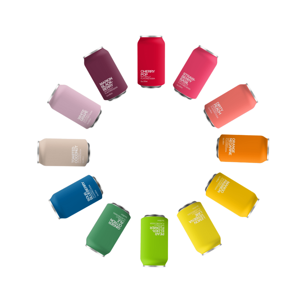
We love the makeover soda that has been given by United Sodas. And so did the judges at this year’s Dieline awards! Winning ‘Best Brand Identity’ 🌟.
United Sodas has been reimagined from the inside out. The brand has enjoyed a contemporary update without all the high-fructose corn syrup and artificial flavorings. Each can is wrapped in a unique single color linked to the natural flavor it represents while the copy is expressed in a bold and confident type. Striking simplicity for each of the 12 variants.
The message is clear – connecting culture and people can make a brand pop 💥 .
Which one is your favorite? Find out more 👉🏼 https://buff.ly/3yvARCK
9. Le Chocolat des francais’s genuous packaging
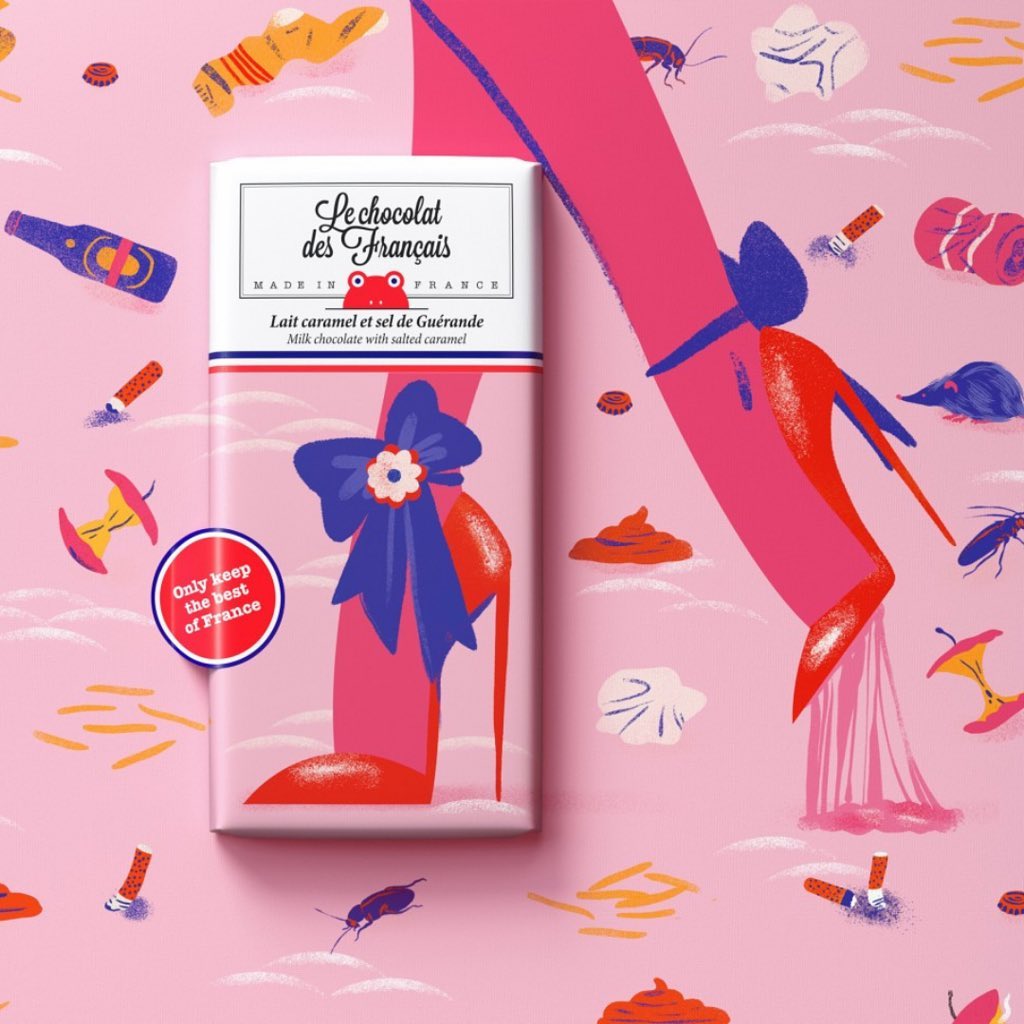
We love the brilliance behind the latest campaign for Le Chocolate Des Francais ❤️.
The series of illustrations “Keep only the best of France” showcase the little habits and iconic moments that make up the clichés of France that were missed while the country was in lockdown during the pandemic. On-pack, the design depicts the romance of France, whilst the wider integrated campaign illustrates the nitty-gritty side that is missed just as much.
Simple creative genius by the advertising agency TBWA\PARIS and the illustrators.
Find out more 👉🏼 https://buff.ly/3pdlSuW
10. Seedlip’s mushroom packaging
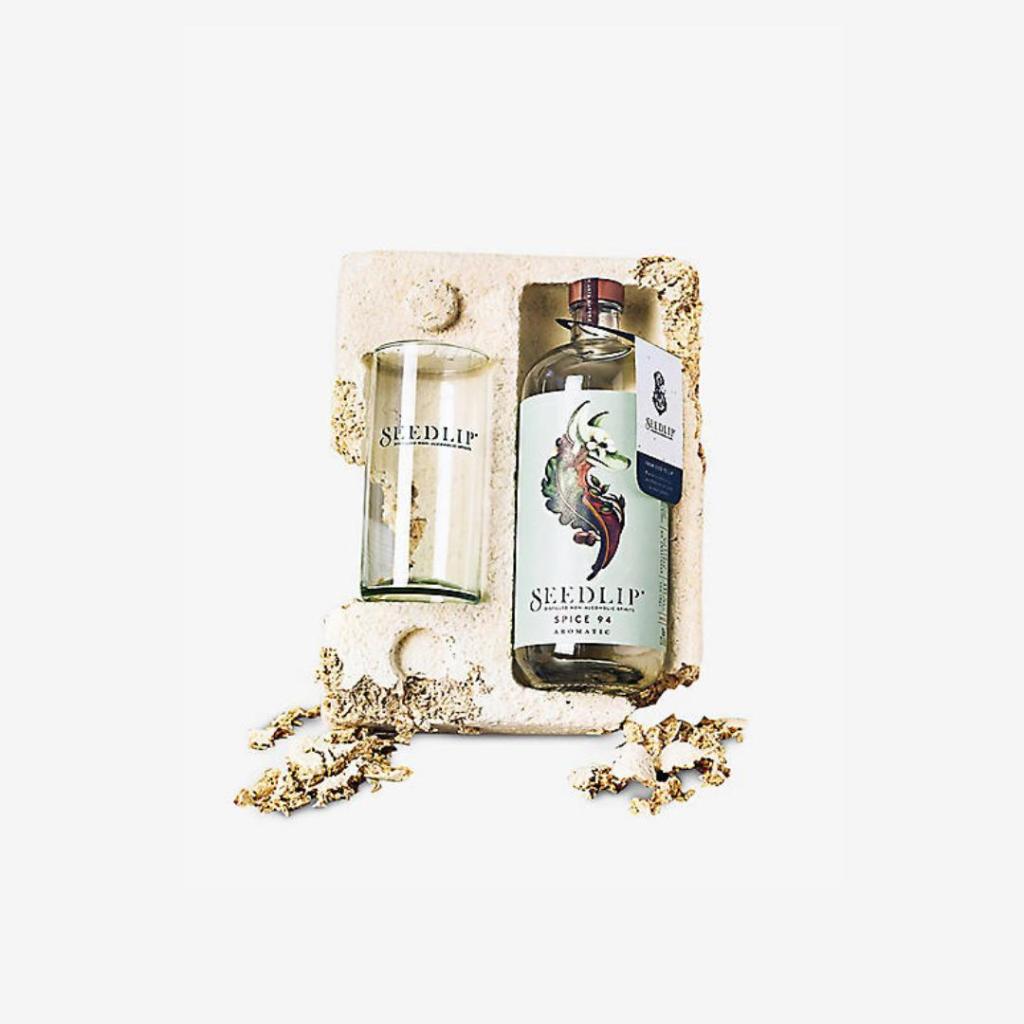
We are in love with this plastic-free alternative that can be broken up to biodegrade on a home compost heap or flowerbed in less than 40 days 😮 .
Magical Mushroom has created this compostable alternative to traditional polystyrene and is being used across a number of brands from cookers to cosmetics to protect their products including non-alcoholic gin brand Seedlip.
It really is magical.
Find out who else is using it 👉 https://buff.ly/3dwrri5
We hope you enjoyed our selection as much as we have loved putting it together. If you’re interested in discovering the most successful marketing campaigns that went viral in 2021, we’ve got you covered. Follow this link to discover our hand-picked compilation of viral marketing campaigns that set new standards in creativity and engagement.
Don’t forget to check out PageProof’s packaging proofing functionality to ensure your next product launch is pixel-perfect.
