Best packaging design that inspired in 2022
Packaging design is a powerful marketing tool that adds value to your brand. It is the first point of contact between consumers and your product. Good packaging design will drive consumer interest in your product, differentiate it from other similar products, and create brand loyalty. In fact, 72% of American consumers say that product packaging design influences their purchase decisions. It is vital that the design is not only eye-catching but reflects your brand identity.
72% of American consumers say packaging design influence their purchase decision
Ipsos
We have curated a list of what we think are brilliant examples of creative packaging design for 2022. Full of bold ideas, inventive typography, beautiful illustrations, and more.
1. Chemistry Gin’s dreamy yet sustainable packaging
Did you know that all gins are required by law to be made with juniper berries, for them to be called gin? It is other botanicals added that differentiate brands. 🌿
The beautiful packaging design of Chemistry Gin tells the wonders of science, nature, and experimentation during the gin’s creation process. The agency behind the design, SingleDouble, used abstract spheres to depict this special interconnection.
The spheres are a reflection of the changing shapes and colors blending into each other. To bring these seemingly floating shapes to life, silver foils have been overprinted to add a 3D effect.🌟
Chemistry Gin takes sustainability seriously. The packaging uses 100% Estal Pharma Wild Glass recycled bottles and 100% cotton uncoated paper materials.
We also love that Chemistry donates $2 from every bottle sold to women in STEM – Science, Technology, Engineering, and Mathematics. 👩🔬
We think this packaging is dreamy. The judges at the Best Awards agreed – awarding it gold in the packaging category in 2022. 💚
Read more 👉: https://buff.ly/3SXhdJY

2. Incredibly romantic brand redesign redefines the language of love
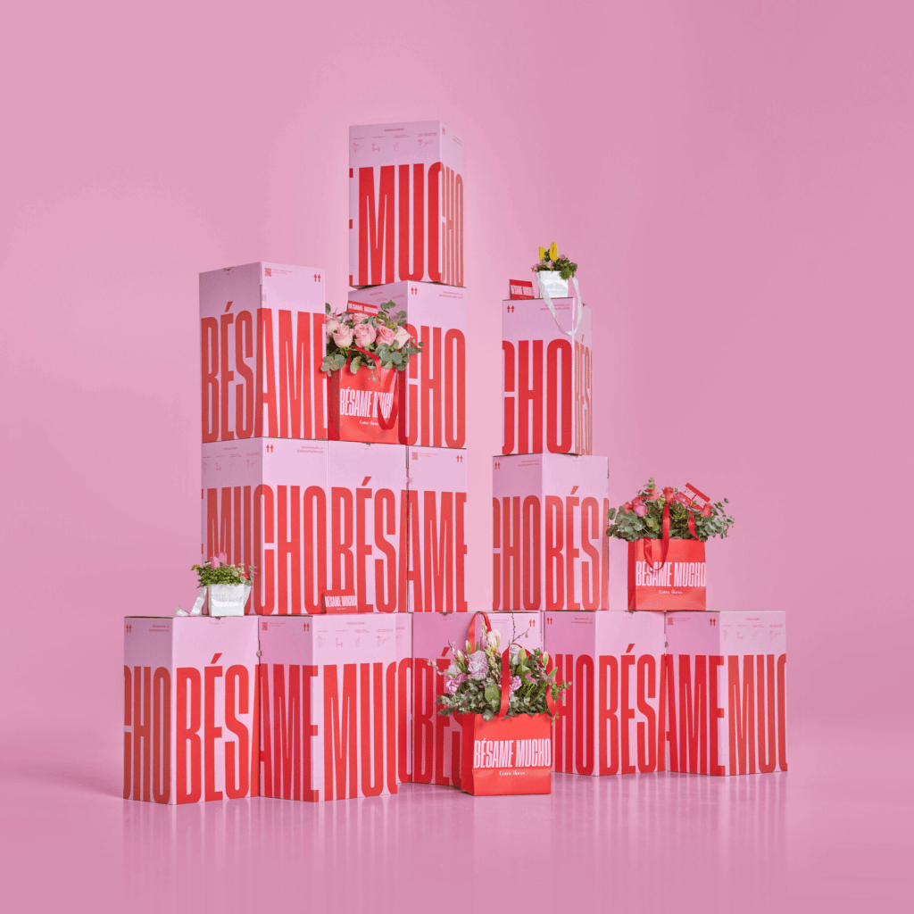
MABA created an incredibly romantic design for a brand that aims to redefine the relationships between people and the language of flowers. 💐
The brand name “Bésame Mucho, Entre Flores” translates to “Kiss me a lot and always among flowers.” From the copy to the graphics on the e-commerce site and packaging, the entire design is fresh and expressive.
A bright red is paired with contrasting warm rose pink. The bold typography exhibits the power of giving flowers. And the moving imagery used on the site inspires. 👄
We love the joy, romance, and youthfulness of this design project, and it was also awarded bronze by Pentawards 2022.
Read more 👉: https://buff.ly/3cKuuFk
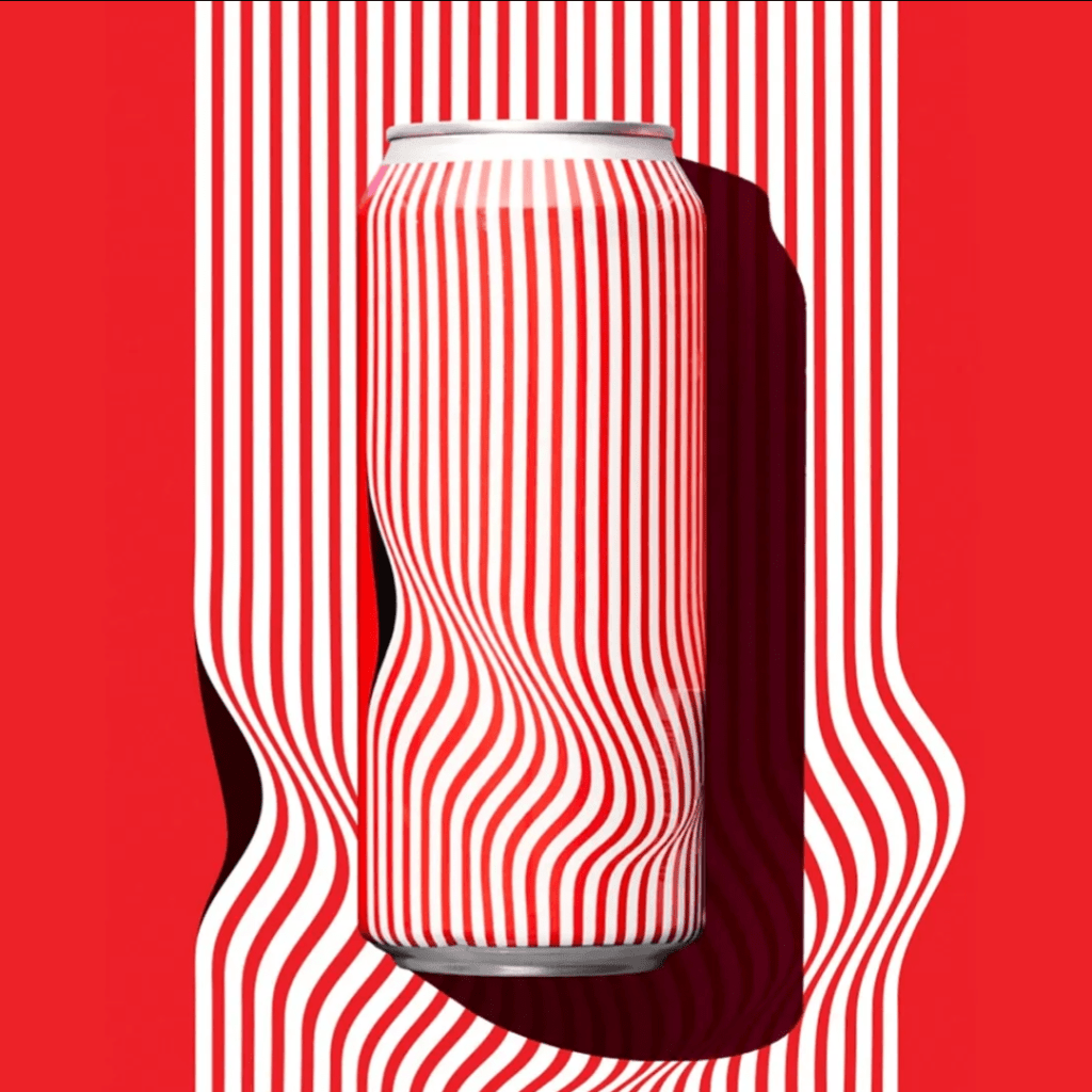
3. Visually immersive beer packaging design inspired by op art
Do you love the use of op art in design 🎨?
Then you will love this mesmerizing packaging design by Juan Carlos Pagan and Sunday Afternoon for Collective Arts Brewery. ✨
The contrast of the bright red and white lines is eye-catching. The clever twist in the design adds an immersive visual impact.
We are enthralled by this mesmerizing packaging design! The judges from ADC Annual Awards 2022 love it too – awarding it sliver in packaging design category. 💚
Read more 👉: https://buff.ly/35n2nZo
4. Dynamite Coffee: explosive packaging design that really wakes you up
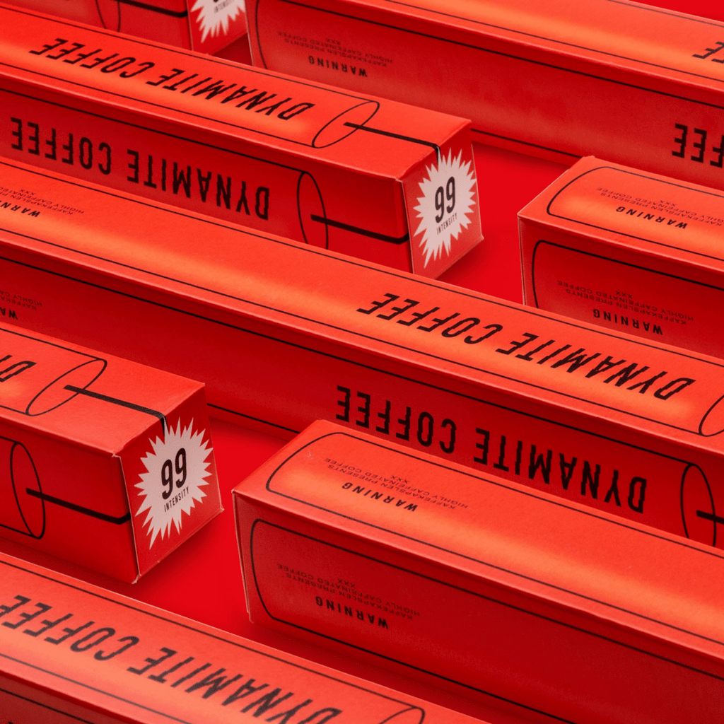
We think “Dynamite Coffee” will really get you going! 🧨
The — pony‘s brand design focuses on the coffee capsules’ extremely high caffeine content. The explosive concept resonated well with the product’s USP and packaging format.
The red color palette and bold typography are clever and effective in communicating the high intensity of the coffee from the moment you see it ☕️.
Find out more 👉🏼 https://buff.ly/3wJQ2bB
5. Packaging redesign of the oldest pizzeria in Naples pops
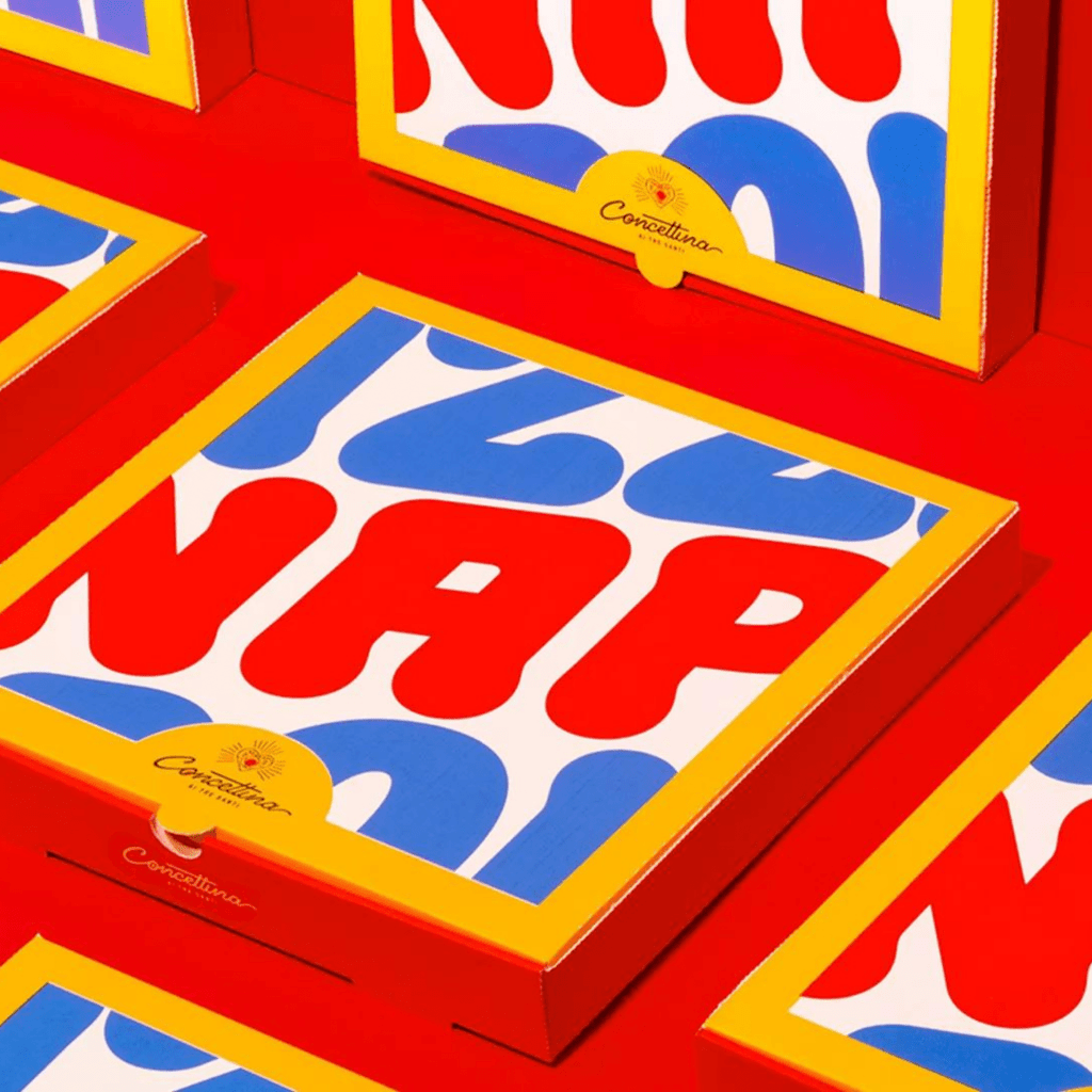
We love how one of Naples’ most famous and oldest pizzerias, Concettina ai Tre Santi has created packaging that pops 🍕.
Designers Alessandro Latela and Emilio La Mura were inspired by familiar Pop Art tropes, using eye-catching, bold typography and a memorable, cheerful palette.
The packaging design also captures many details of everyday life in Naples, elevating them to pop icons and visual expressions of the city. The project was awarded silver for the Pentawards 2022 in the Packaging Brand Identity category. 💚
Find out more 👉🏼 https://buff.ly/3sIn1f1
6. Award-winning Taylor & Smith whisky packaging emulates sunshine
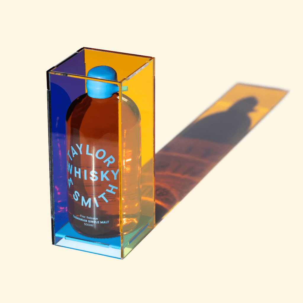
We love how Taylor & Smith Distilling Co. synthesizes its beautiful Tasmanian surroundings into this award-winning whisky to raise your spirits 💚
Bold colors, a recognizable brand quality, reflect the key ingredients and their environmental influences – single malt barley, pristine glacier lake water, the sun, and the clear blue sky. A striking, re-usable display box houses the first release bottles and allows the light to reflect, permeate and showcase the golden liquid.
Sunshine is a metaphor for the smooth, warming spirit and is central to a campaign that challenges industry cliches. How could you resist this glass of sunshine? ☀️
This outstanding project was a hit in packaging design competitions since last year – wining first place in Dark Spirits at the 2021 Dieline Worldwide Package Design Competition and pinnacle in packaging at the AGDA Awards. It was also awarded both gold and bronze in the Pentawards 2022. 🏆
Find out more 👉🏼https://buff.ly/3JUqL3P
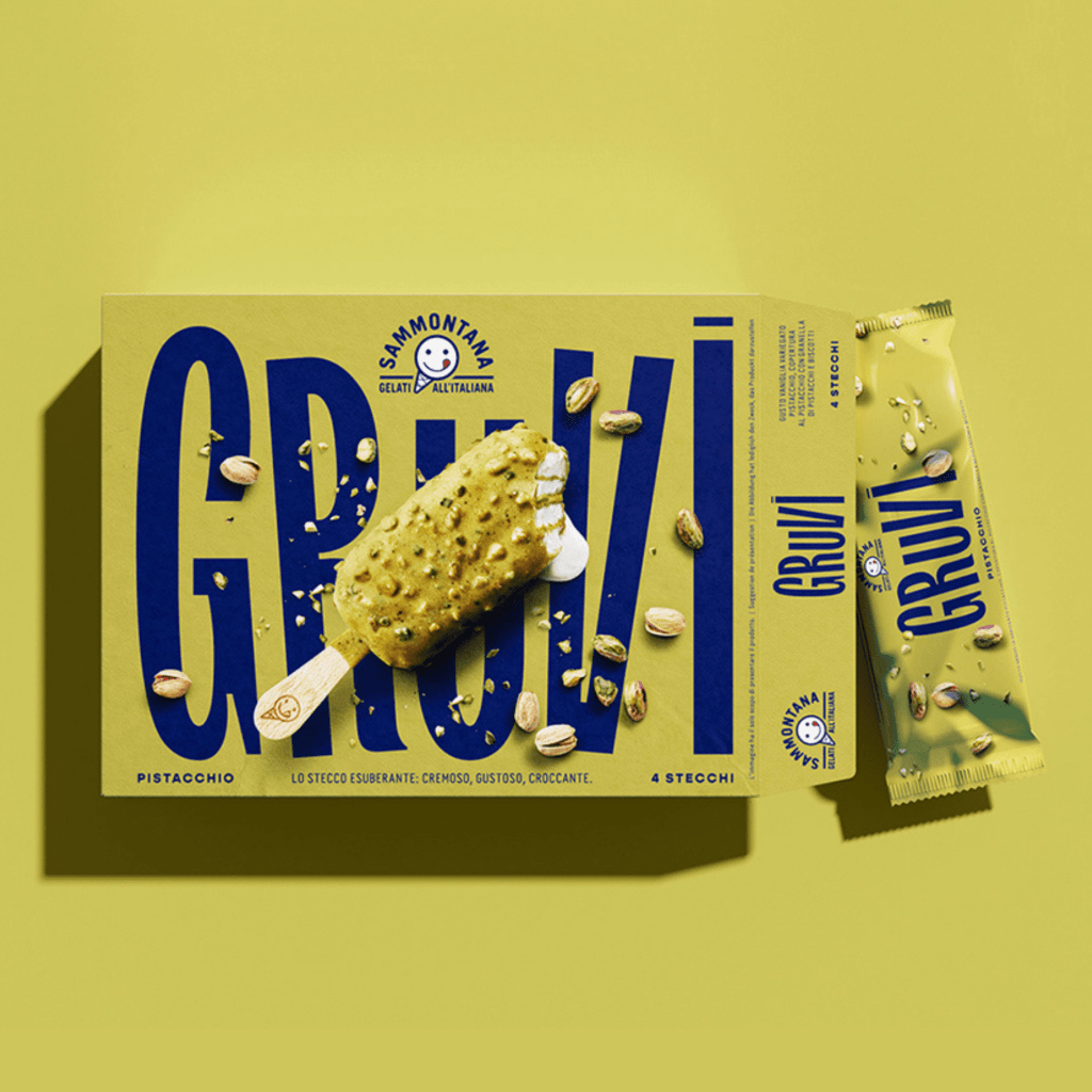
7. Irresistible Gruvi packaging design wins gold at Pentawards
We love this packaging for Gruvi by Sammontana that has the product practically leaping off the paper 💥
The design aims to convey the 3 different sensations for this unexpected and irresistibly, yummy gelato – soft, creamy, crunchy.
The funky typography brings another level of fun to the branding and allows this brand to instantly stand out to consumers looking for a way to treat themselves.
The judges from Pentawards loved it too! This project not only wins a gold in the desserts and sweet foods category for 2021, but the latest design from the same brand and designers wins a bronze in Pentawards 2022. 🌟
Find out more 👉🏼https://buff.ly/3pFqZ5a
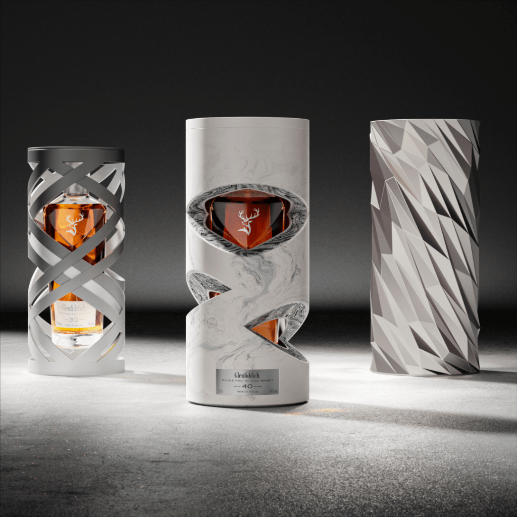
8. Glenfiddich re-images time with a spectacular packaging design
As the global demand for whisky grows, the rapidly changing market is pushing brands to a new frontier. 🌎
Whisky luxury brand Glenfiddich has launched Time Re: Imagined – a range of 50, 40, and 30-year-old single malt whiskies. This stunning artwork, designed by Here Design, cleverly re-imagines the concept of time with a packaging system.
To reflect the complex layers that whisky develops over time, the packaging uses unique sculptures to capture and visualize fleeting moments, linking the past to the present. Each of the three different whiskies has an extraordinary interpretation of time and complexity of flavor. The frozen hanging ribbon represents 30 years, the dramatic interwoven veins represent 40 years, and the artistic shell formed with climate data represents the rarest of all, 50 years. 🥃
We think this design redefines the luxury whisky category, and its innovative packaging system is spectacular. 💚
Read more: https://buff.ly/3UTKe9Z
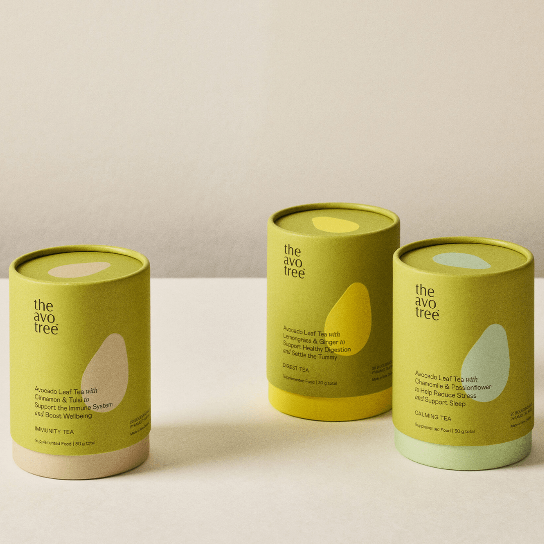
9. The Avo Tree’s packaging design is inspired by its simple natural ingredients
Did you know that avocados not only have health benefits but can also make your skin glow? 🥑
With a tribute to the unassuming but valuable avocado, The Avo Tree’s wellness teas and skincare products are based on ingredients derived from the avocado tree. The packaging, designed by Marx Design, was inspired by the simplicity and natural ingredients of The Avo Tree products.
The naming convention of each product makes the benefits easy for the consumer to understand by using a simple formula of: What it’s good for and why it works. For example: Avocado (Leaf or Oil) + X + Y = Good for that.
The minimalist typography is paired with the earthy colors found in avocados. And the simple avocado silhouette becomes the brand motif, used as a subtle accent that is embossed on the uncoated outer boxes in its skincare line. The inner vessels have a tactile gloss finish contrasted against matte white. 🌱
We think the design perfectly connects the brand’s natural ingredients and messaging. It makes it a worthy finalist in the Best Awards 2022. 💚
Read more 👉:https://buff.ly/3wn0Xs2
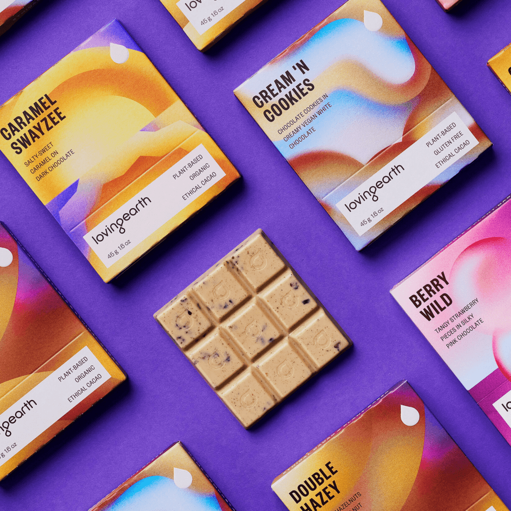
10. Loving Earth’s packaging design captures magical sensory bliss
Do you love design that is fantastical? Then you will love Loving Earth’s magical and dreamy packaging for its ethical and sustainable chocolate brand.🍫
The design is the brainchild of Marx Design, who was inspired by the chemical reactions triggered in the brain when people eat chocolate. They wanted to visually highlight this unique sensory experience that chocolate brings: craving, rush, and indulgence. 🔮
Layers of color gradients are beautifully printed on uncoated paper and color cues are matched by the recognizable ingredients of the different flavors.
As an ethical brand, Loving Earth cares not only about the health of the consumer, but also the growers. It takes the manufacturing back to the indigenous communities who grow and process the raw materials, thus adding more value to their work and increasing their family income.
We think Loving Earth has new packaging design takes this outstanding product to multi-sensory bliss.💚
We love that this design has been awarded sliver for the Best Awards 2022 in the packaging category.
Read more 👉: https://buff.ly/3QMbg0T
We hope you enjoyed our selection of best packaging designs for 2022 as much as we loved putting them together. Every year brings new design trends driven by changes in the world around us. They take inspiration from what happened before, helping us try to predict the future. In addition, be sure to explore our comprehensive summary of the top design trends for 2023. We can’t wait to see how these will shape packaging design in the coming year.
Don’t forget to check out PageProof’s packaging proofing functionality to ensure your next product launch is pixel-perfect.
