Accessible design tips to ensure inclusivity online

Accessible design allows people with disabilities to see, navigate, and interact in a world without obstacles. Best of all, designing with accessibility in mind means that even people beyond your intended target users may benefit. Designs will be less cluttered, focusing on key information. Captions help sighted people understand images. Alt text appears when images don’t load, helping sighted users understand what they are missing. Ultimately, designing with accessibility is for everyone – not only helping people with disabilities but also people without disabilities. And for businesses, there are a multitude of positive impacts also.
Why is accessible design important?
According to World Health Organization, there are one billion people with disabilities in the world, which accounts for 10-15% of the world’s population. This can include people who are blind, color blind, or have low vision, those who are deaf or have hearing difficulties, people with mobility impairments (temporary or permanent), or people with cognitive disabilities. So every design should consider the most diverse set of users that will interact with your products, marketing, or internal documents.
Here are some facts about disability that you might not know:
Visual disabilities
Globally, at least 2.2 billion people suffer from visual impairments. Common disabilities include:
- Low vision
- Muscle degeneration
- Cataracts
- Diabetic retinopathy
- Glaucoma
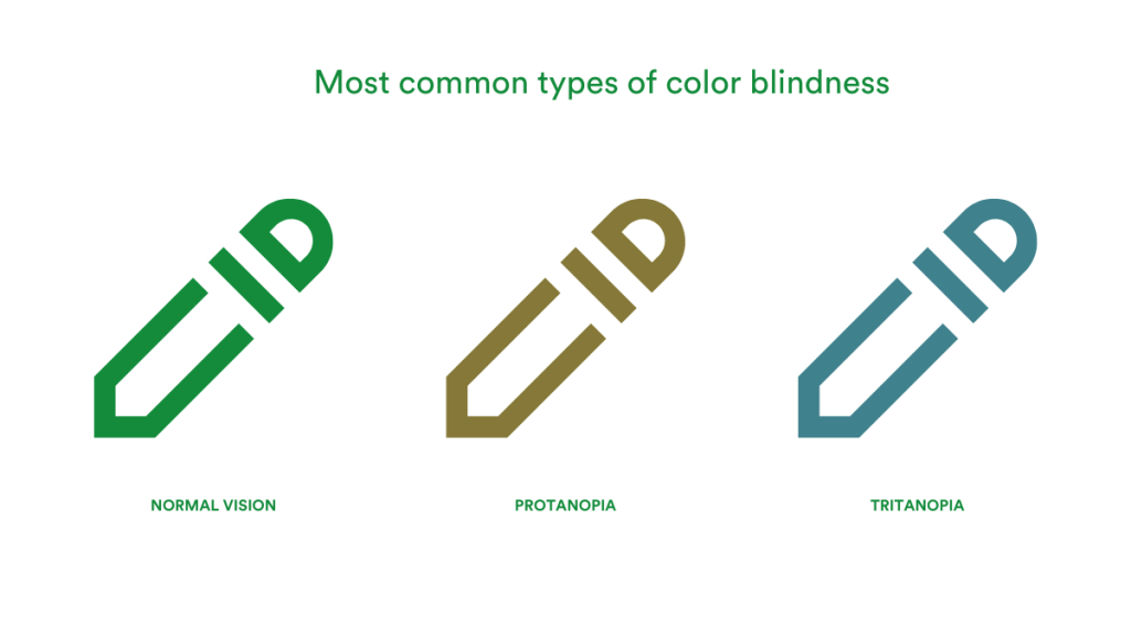
In addition, approximately 1 in 12 men (8%) and 1 in 200 women are color blind. The most common type of color blindness is protanopia (inability to see red and green), followed by tritanopia (inability to perceive blue and yellow) and, most rarely, total color blindness.
Neurodiversity
Neurodiversity refers to the ways in which people experience and interact with the world around them in many different ways. To a normal person, a neurodiverse person does not have the “right” way of thinking, learning and behaving, and these differences are considered disabilities. Common examples of neurodiversity are: autism, attention-deficit/hyperactivity disorder, dyslexia, over-reading, synaesthesia, traumatic brain injury, down syndrome, epilepsy, etc.
Able-bodied people
Even able-bodied people may experience temporary “disability” at some point. The most common scenarios that require accessible design are: pregnant women, carrying a baby, holding a phone, or having a broken arm or leg. Moreover, accessible design will always keep the audience experience in mind when designing – even screen glare, high background noise, and slow internet speeds are potential issues.
Benefits of accessible design
The most obvious reason is by making your product accessible a huge number of additional people will now have an optimal experience with your brand. Therefore, growing your potential market and revenue. Secondly, it actually reduces the number of iterations of your design workflow, by considering broader issues beforehand. Saving you time and money. Lastly, if you ignore accessibility guidelines, there maybe be hefty lawsuits and negative public exposure. Both affect your bottom line negatively.
Accessible design creates a wide range of ethical, legal, brand, and other business benefits.
What is the key to accessible design?
A human-centered design philosophy is essential to achieving accessible design. It considers all humans as its target audience, including a range of user journeys, environments, and mindsets. Human needs should be placed at the heart of the design process. Meaning that accessibility, inclusiveness, perception, contrast, and usability are facilitated. The ultimate goal is for everyone to be able to interact with the design and use it effectively. Accessible design is required to meet the following needs:
- Visual needs: make it easy to view and adapt to visual needs
- Auditory needs: make it easy to hear and adapt to auditory needs
- Motor needs: make it easy to interact and accommodate motor needs
- Cognitive needs: make it easy to understand and adapt to cognitive needs.

Guidelines for accessible design
Color
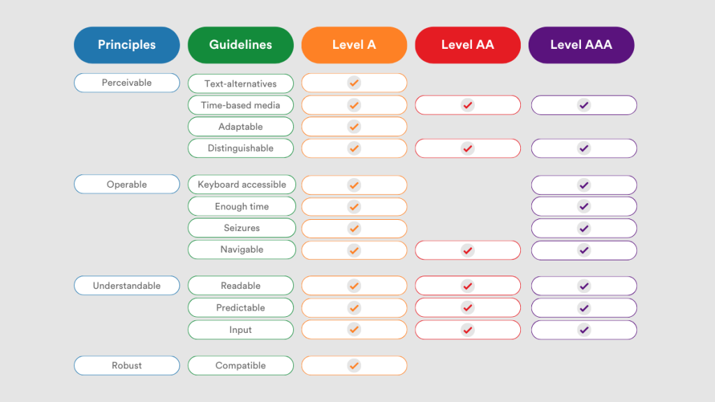
People with visual disabilities are less sensitive to color contrast. When you use the wrong combination of colors in your design, people with visual disabilities may not be able to see the text on it at all. It is therefore important to keep accessibility in mind when choosing colors. A great tool to check whether your design is accessible, regardless of the format, is the WCAG (Web content accessibility guidelines) that identifies 3 levels of conformance.
Tools for further reading
- Use PageProof’s color check tool to verify color and contrast directly in your online proofing workflow.
- Use Colors to check color contrast – grab the hex codes and paste them into this online accessibility check
- Use Adobe Color to create a color-blind friendly palette
- Download TPGi’s free color contrast checker tool to use an eyedropper tool and not have to leave your design apps
Typography
The font you choose has a huge impact on a user’s experience, whether on a website or in printed material. Many modern designs use beautiful lightweight fonts, but these are difficult to read for people with impaired vision. For accessible typography, you need to make sure that your chosen font is legible and easy to read:
- Legibility: The design of the typeface impacts the ease with which one letter can be distinguished from another.
- Readability: How the typeface is used. Good typography will stimulate the desire to read and reduce the effort required to read and understand.
How we read a font
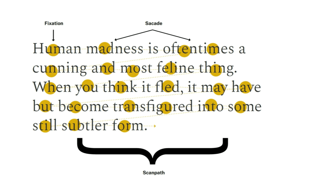
People tend to read by quickly scanning around the letters and letter shapes to best guess what the words are. We quickly focus on roughly the middle of the word and the letters surrounding it, before scanning over the shape the letters make to have a best guess at what the word is. Fixing on the elements of text is known as fixation while scanning the text is called sacade.
It is important that forms and counter-forms of text are well-balanced for easier legibility. This means the shape of the text and the negative space around it. You want balanced proportions. The X height (where the top of the lowercase letter comes to) needs to be greater. Therefore, it is especially vital to consider accessibility from the start and to maintain consistency between web and print documents.
General rules for type (not hard and fast)
Here are some other rules to keep in mind to ensure accessible design:
- Text size:
- printed body copy should be 9-14pt
- screens 16px
- 72pts for each 25ft of viewing distance
- Characters must have a width-to-height ratio between 3:5 and 1:1
- Stroke characters must have a width-to-height-ratio between 1:5 and 1:10
- Line length of approximately 4 inches or 39 characters is ideal for readability
- Point size is 2x size of body resulting in the ideal line length
- Left aligned text is easier for western audiences to read, but depending on the audience’s preference
- Full breaks are easiest to show a new paragraph/thought that is occurring
- Grid systems are a clear way to walk users through information.
Tools for further reading
- Typography training to help designers
- Accessible graphic design handbook
- The design accessibility checklist
- Essential checklist to ensure designs are prepress ready
- The WCAG checklist for web accessibility
Alt text
It is a requirement by WCAG, the international industry standard for accessibility, that all non-text content should have an alternative text description. Alternative text enables the user to understand the purpose of the image, such as location, color, mood, story. This ensures that all users, regardless of visual ability, can enjoy all visual content.
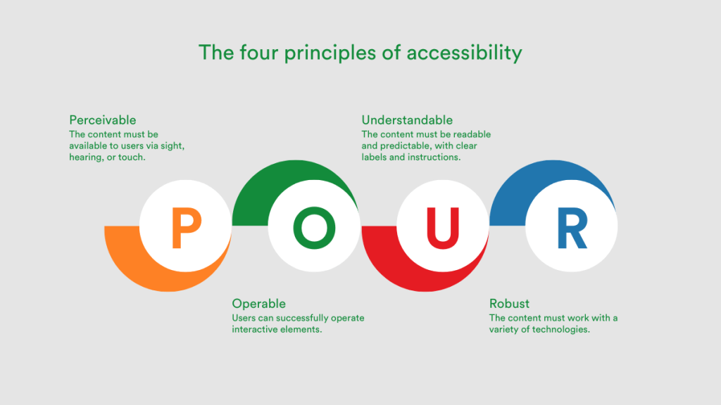
WCAG has four main accessibility guiding principles called POUR – Perceivable, Operable, Understandable, and Robust. Many of the technical challenges and needs faced by people with disabilities can be addressed using the POUR principles.
For the description of images, WCAG has the following specific guidelines to follow:
- Keep descriptions as concise as possible and not too wordy
- Decorative images can be skipped if the information in the image is repeated on the page or used for aesthetic purposes only
- Avoid images that contain text, and if this is unavoidable, always place the text in the image in alt text
- Use a screen reader to check your design and see how people using the screen reader will interact with your design
- Provide an audio captcha – visual captchas do not provide alternative text
- Alt text should not start with “image of” or “picture of” because most screen readers will detect images.
Note: Do not rely on artificial intelligence, it is rarely accurate.
Social media
Alternative text should be used wherever possible – from web design to social media. You can turn this feature on in the software settings, either nested in a post or nested in the app settings. Including alternative text in social media will improve the accessibility experience. For example, for users who have screen readers, Instagram stories are not as accessible as posts because the captions automatically generated for stories are not accurate. Therefore, when you are adding posts to social media, you can improve accessibility by paying attention to the following points:
- Clean and simple text posts are usually best. Handwritten fonts are hard to read.
- Accessibility can be improved by breaking up text posts and adding padding
- When adding subject tags, capitalize each word, otherwise, screen readers will not be able to distinguish between them. For example, #thisisabadhashtag vs. #ThisIsAGoodHashtag
- Try not to use multiple emoticons per paragraph
- Captions are required for all video and audio content
- If posting content about sensitive/distressing topics, add content and trigger a warning. For example, add CW or TW and a cover image to the top of the post description to hide sensitive/distressing content from users.
In summary
The number of people with disabilities in the world is significant. It is therefore important to consider all human needs. Embracing accessibility in design leads to multiple benefits. These range from reaching new potential audiences, strengthening your final design, and potentially reducing legal risks. There are some key principles that you need to follow when you design with accessibility in mind. Typography, alt text, colors, and social media all have clear guidelines to adhere to. If you need some examples of accessible designs, you can use this link to see our selection of the best accessible designs. We have also created a concise accessibility checklist that makes it easy to ensure your design is accessible.


