What was the color of the year in 2019?
Since 2000, the global authority on color Pantone Color Institute has been influencing fashion trends and buying decisions worldwide by announcing a Color of the Year.
Twice a year the company hosts a secret meeting of representatives from various nations’ color standards groups and after two days of presentations and debate, they choose a color for the following year that represents the globe’s ‘spirit of the time’.
The forward-looking color selected to uplift us all for 2019 is:
Pantone color 16-1546 Living Coral
“An animating and life-affirming coral hue with a golden undertone that energizes and enlivens with a softer edge”
Pantone Color Institute
The orange base, rather than pink tone creates a warmth that compliments most skin
The winning color is described as “vibrant, yet mellow, Pantone 16-1546 Living Coral embraces us with warmth and nourishment to provide comfort and buoyancy in our continually shifting environment”. Consider using coral tones in technology, especially digital posts as not only does it ‘pop’ digital content, but the vibrant color is perceived as bridging the gap between technology and nature.

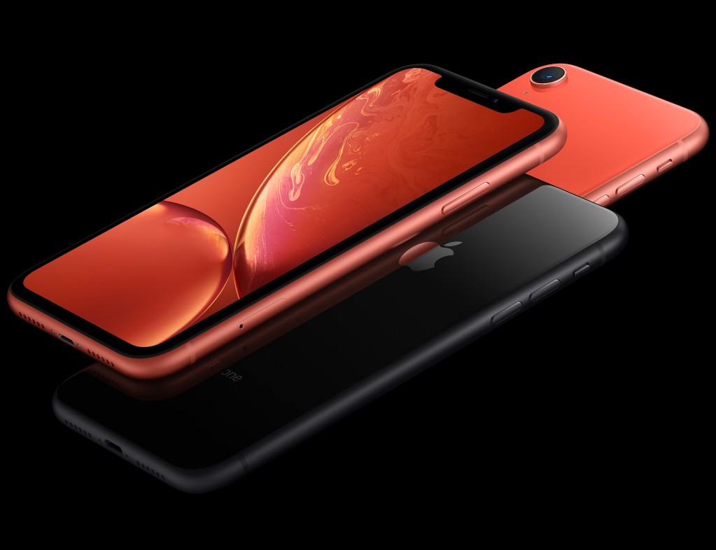
Even before it was announced, Apple led the way introducing it into its most recent iPhones, and HT to AirBnB bringing it through since its rebrand in 2014.
If you’re a designer, take a look at this Living Coral themed image stock collection put together by Adobe for inspiration.
Here’s how to up your color conversation
Color lovers #ShineOn 💎
1. The ABCs of color acronyms
RGB: red, green, blue. This is the system for specifying all
Hex: Hexadecimal is the six-digit set of letters and numbers used in web projects where the first two represent red, second two green and the last two blue. For example #138b3b (our brand color for PageProof).
CMYK: Refers to the four inks used in a standard 4-color printing process (cyan, magenta, yellow and black).
PMS: Pantone matching system. Thousands of color swatches that each have a unique number. This number means printers, deisgners and ink manufacturers can all match the exact same swatch.
2. Why K for black?
K actually refers to key. In 4-color
3. Seeing red

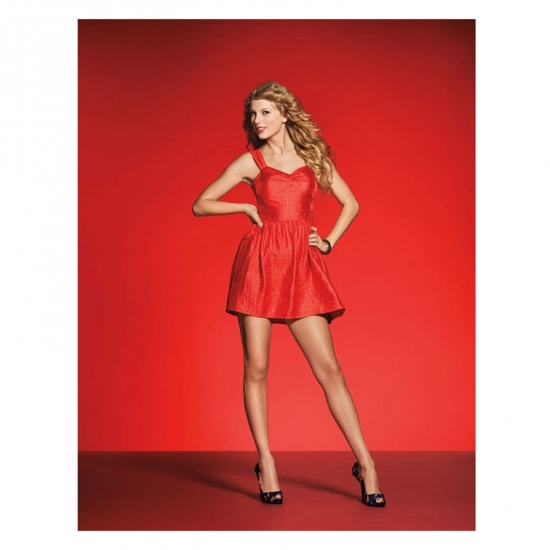
The color red was mentioned 186 million times in 2012 on social media thanks to Taylor Swift’s album RED, NASA’s landing of the moon rover on the red planet Mars, and various media coverages of red carpet events.
4. Tiffany blue

The custom color created by Pantone for Tiffany is called Pantone 1837 Blue and ensures Tiffany’s brand is consistent around the globe. 1837 marks the founding year by Charles Lewis Tiffany.
To really impress your designer friends – mention the embossed font for Tiffany & Co on the box packaging is Baskerville Old Face.
5. Minion Yellow

The Illuminating, energetic, and fun-loving characters of the Despicable Me franchise are captured in an extroverted, playful, and warm yellow shade. Pantone Minion Yellow marks the first time in the global color authority’s history that a color has been created and named after a character.
If you are reviewing your design daily for artwork accuracy, don’t forget to check out our world-first feature – PageProof ColorSep®. Ensure your artwork composition and colors are perfect, reduce the cost of mistakes, and much more 💚.


