How to check color contrast for design accessibility
Over 2.2 billion people live with a visual impairment – and for many, poor color contrast is a very real barrier. Are your designs truly accessible to everyone?
When the contrast between text and background is too low, content can be difficult or even impossible for some users to read.
For creative and marketing teams delivering content at scale, maintaining visual clarity and meeting accessibility standards isn’t just important – it’s essential.
In this article, we’ll walk you through how to test and optimize color contrast – using tools like the WebAIM Contrast Checker, PageProof, or Stark – to ensure your designs are not only beautiful and on-brand but also fully accessible to everyone.
Key takeaways
- Poor color contrast can prevent over 2.2 billion people with visual impairments from accessing your content.
- WCAG guidelines define contrast ratios to ensure text is readable for all users.
- Tools like PageProof’s color check make it easy to test and meet accessibility standards.
- Integrating contrast checks into your creative workflow ensures inclusive, on-brand content every time.
Why color contrast matters
Color contrast directly affects how easily users can read and understand content – especially those with visual impairments like color blindness, low vision, or age-related eye conditions.
When contrast is too low, your content becomes inaccessible to around one quarter of the global population. This not only limits your reach but can also diminish your overall impact – especially when accessibility for all users, including those using screen readers, isn’t prioritized. According to WebAIM, over 79.1% of homepages analyzed in their 2025 accessibility report had insufficient contrast issues – one of the most common accessibility failures.
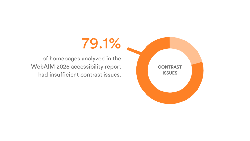
Source: The WebAIM Million
Good color contrast also enhances the user experience for all viewers, improving readability in bright environments, on small screens, or for users who may be quickly scanning content.
Beyond accessibility, it impacts engagement and performance. If a call-to-action is hard to see, people won’t click. If body text is difficult to read, users will bounce.
Strong contrast helps you build inclusive, effective, and WCAG-compliant designs – and shows your audience you care about delivering content they can actually use.
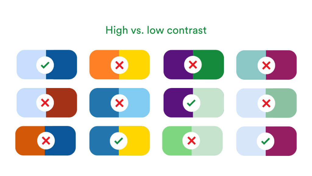
Examples of high vs. low color contrast.
Understanding accessibility standards
The Web Content Accessibility Guidelines (WCAG) 2.1 set global standards for digital accessibility.
For color contrast, they define two levels of compliance:
WCAG levels explained
AA compliance:
- Minimum contrast ratio of 4.5:1 for normal text
- 3:1 for large text (above 18pt or 14pt bold).
AAA compliance:
- 7:1 for normal text
- 4.5:1 for large text.
Choosing the right level of compliance
AA compliance suits users with mild vision loss (20/40), common in those aged 45+. AAA is better for those with more severe vision loss (20/80), eye diseases, or aged 70+, offering greater accessibility for older or visually impaired audiences.
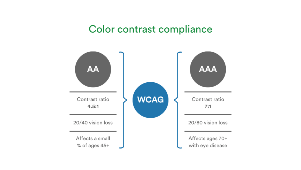
Color contrast minimum requirements for AA and AAA compliance under WCAG.
Understanding these standards is crucial for designing interfaces that are readable by all. To ensure full accessibility, consider additional support for users who rely on screen readers and other assistive technologies.
What does the contrast ratio mean?
The contrast ratio measures the difference in luminance between text and its background color. It ranges from 1:1 (no contrast, like white on white) to 21:1 (maximum contrast, like black on white).
A higher ratio means greater contrast, which helps users with visual impairments distinguish text more easily. There’s no requirement for contrast ratios higher than 7:1 in WCAG because that level is considered sufficiently high to ensure readability for almost all users with low vision or color blindness.
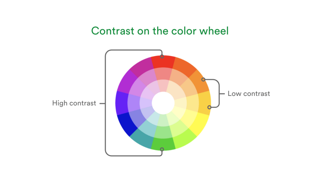
Examples of high and low color contrast using the color wheel.
How to test color contrast
There are several easy-to-use tools that help designers check whether their color choices meet accessibility requirements.
Step-by-step guide to test colors
- Choose your colors: Identify the foreground (text) and background color.
- Use a contrast checker tool:
- Enter a color code (e.g., hex, RGB, etc), or use an eyedropper tool to select a color.
- Tools display contrast ratios and a WCAG pass/fail status.
- Review the results:
- Aim for at least AA compliance for all text.
- Adjust color brightness, hue, or saturation if contrast is insufficient.
Popular color contrast tools
- WebAIM Contrast Checker: Simple input with clear results.
- PageProof color check: Powerful online proofing software with a color check tool to verify colors and contrast.
- Coolors Contrast Checker: A visual tool ideal for UI designers.
- Contrast Ratio by Lea Verou: A minimalistic tool for quick checks.
- Stark: Tools to ensure your colors meet accessibility standards.
These tools are especially useful during iterative design processes, helping you adapt color choices as your creative vision evolves.
Real-world examples
Here are common examples of contrast challenges:
Insufficient contrast
Light gray text (#cccccc) on white background (#ffffff) – Fails AA and AAA.
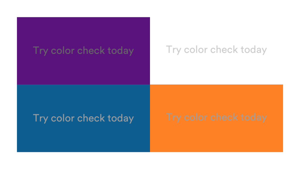
Examples of insufficient contrast between the text and background color.
Good contrast
Navy text (#1a1a80) on white – Passes AA and AAA for all text sizes.
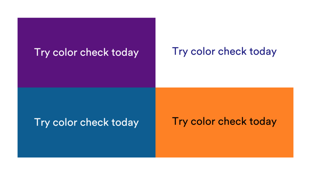
Examples of sufficient contrast between the text and background color.
Contrast matters when creating marketing collateral
Contrast issues frequently crop up in a wide range of marketing materials.
Here are five common types of content where ensuring sufficient contrast is crucial for readability and accessibility:
- Landing pages – Key messaging and CTAs must be easy to read at a glance.
- Email campaigns – Low-contrast body text can lead to missed information or reduced engagement.
- Social media graphics – Color combinations that look great on screen may not meet accessibility standards.
- Digital ads – Small text and colored backgrounds require careful contrast consideration to stay compliant.
- Presentation decks – Large, high-contrast text is essential, as poor contrast or small font sizes can impact how content is received during webinars or sales pitches, especially when viewed from a distance.
- Form submissions – Buttons and field text need to be extremely legible to help ensure accessible, user-friendly experiences.
- Infographics – When presenting data visually, especially with multiple data points, using distinct, high-contrast colors ensures each element stands out and remains accessible.
Introducing PageProof’s new color check tool
For teams creating content at scale, running accessibility checks across every creative asset can be tedious, but it doesn’t have to be.
Color confidence made easy
PageProof’s new color check feature makes it easy to verify that colors meet WCAG contrast standards – without interrupting your creative workflow.
- Use the eyedropper tool to select colors directly from your work.
- Instantly compare two colors to check their contrast ratio.
- Receive a clear pass/fail message like “Meets AA for all text sizes,” for example.
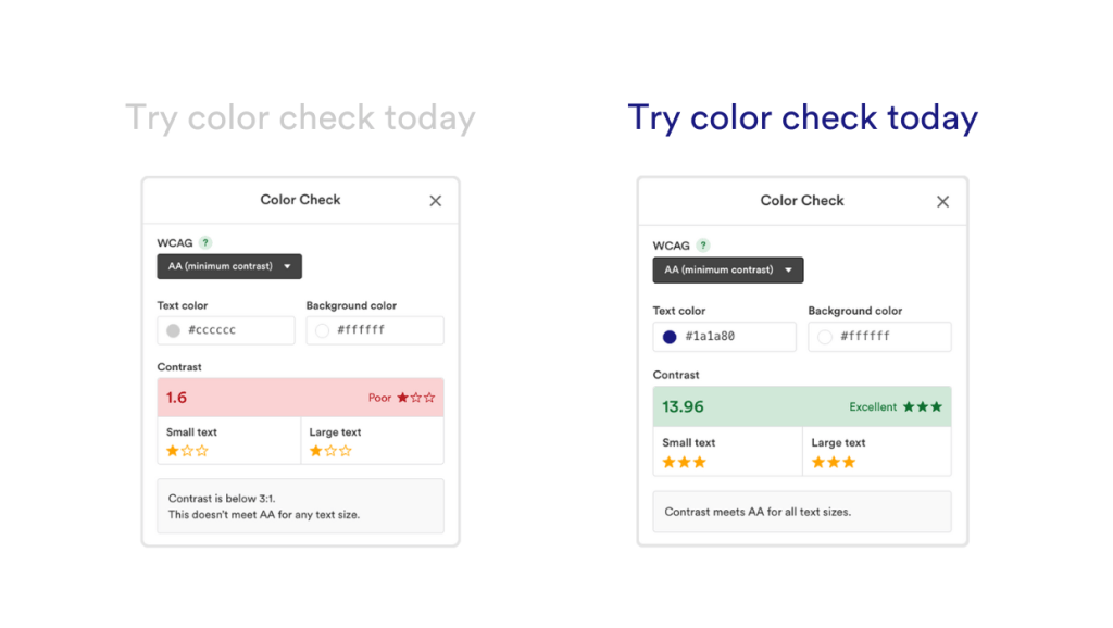
PageProof color check makes it easy to check color contrast.
Integrated into your review process
Color check is built right into the PageProof proofing screen, so accessibility checks happen seamlessly within your creative review process – no need to step outside the approval flow. This is especially valuable in industries like:
- Government & education – where WCAG compliance is non-negotiable
- Finance & healthcare – where clarity and compliance reduce legal risk
By catching issues before sign-off, your team ensures that every piece of creative work is on-brand, accessible, and confidently approved.
And the best part? Color check is included in all PageProof plans.
Final thoughts
Ensuring strong color contrast isn’t just about avoiding fines, legal action, or damaging your brand’s reputation – it’s about creating content that connects with everyone.
With tools like PageProof’s color check, designing with accessibility in mind becomes a seamless part of your creative review process.
FAQs
How to check color contrast for accessibility?
To check color contrast for accessibility, use tools like PageProof’s color check, WebAIM Contrast Checker, or Stark. These tools help you measure the contrast between text and background to ensure it meets WCAG accessibility standards.
What is a good contrast ratio for accessibility?
For WCAG AA compliance, aim for a minimum contrast ratio of 4.5:1 for normal text and 3:1 for large text. For AAA compliance, the requirement is 7:1 for normal text and 4.5:1 for large text.


